

LOGO


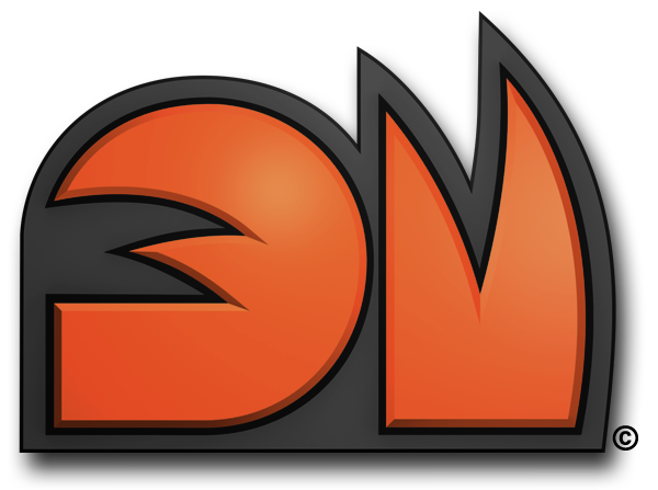
DinoMonsters© logo breakdown
The DinoMonsters© logo is a simple and
recognizable combination of shapes
and colors. It’s constitution comes from
two capital letters that are initials to
DinoMonsters© , D and M.
Letter D
This initial letter symbolizes two things.
The square base that is protruding in a
circular curve to the top, and gradually
bends back again, symbolizes tail, since
all of six team members got tail during
the mutation. Other, more significant symbol lies within the letter, outlining
the inner part of D, in a shape of
leaders hand. To explain a bit, Ty has a disability in his finger count. In the “Null” event he was struck with highly mutagenic fragments chipped of of mysterious object and picked the genetic code of Tyrannosauridae dinosaur family, which is known to have only two fingers on their forearms.

Letter M
It is a clean cut of stylized Ty’s hand with it’s two fingers showing victoriously upwards. Repeating Ty's stylized hand two times
only implies to his unquestionable role of the leader. Beside these targeted elements, the logo could interpret some other
things related to DinoMonsters© as well, such as sharp teeth, big claws, and anything else one dinosaur could have.
Color
Playful and energetic shade of reddish Orange color used for DinoMonsters© logo was obvious solution, because, orange embodies DinoMonsters© characters in many more ways then just playfulness and energy. Rock solid gray, aside for making great background color, does a great job by empowering this already strong eye catcher.
With the help of thick black stroke around the letters that gives away the strength and authority of the team , this logo is
unseparable shape in Dinomonsters© unique identity.


